Displays: Tree and List
This page provide mode details about how to view the data in this version in a Hierarchical Tree Display or a Nested List Display. The seletection of display types could depends on the user's need.
Hierarchical Tree Display
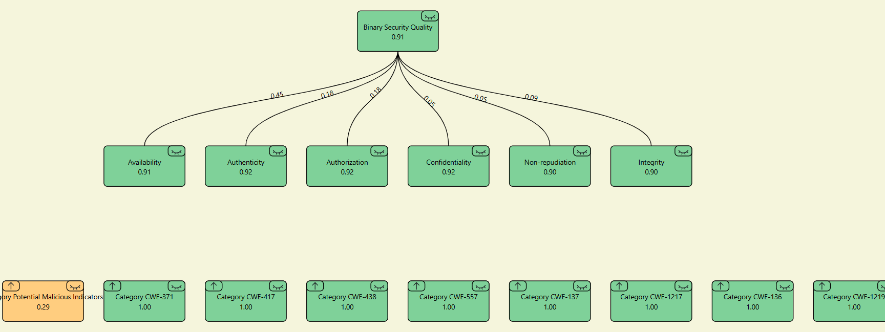
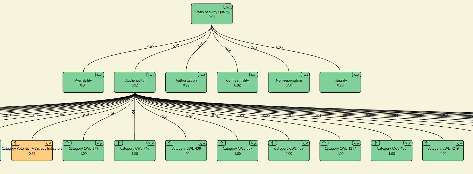
The Hierarchical Tree Display helps visualize data in a structured way. Each node represents a component, with subnodes branching out to show relationships.
How It Works
Interacting with Nodes
- Click a node to reveal lines connecting it to its subnodes, along with percentage values
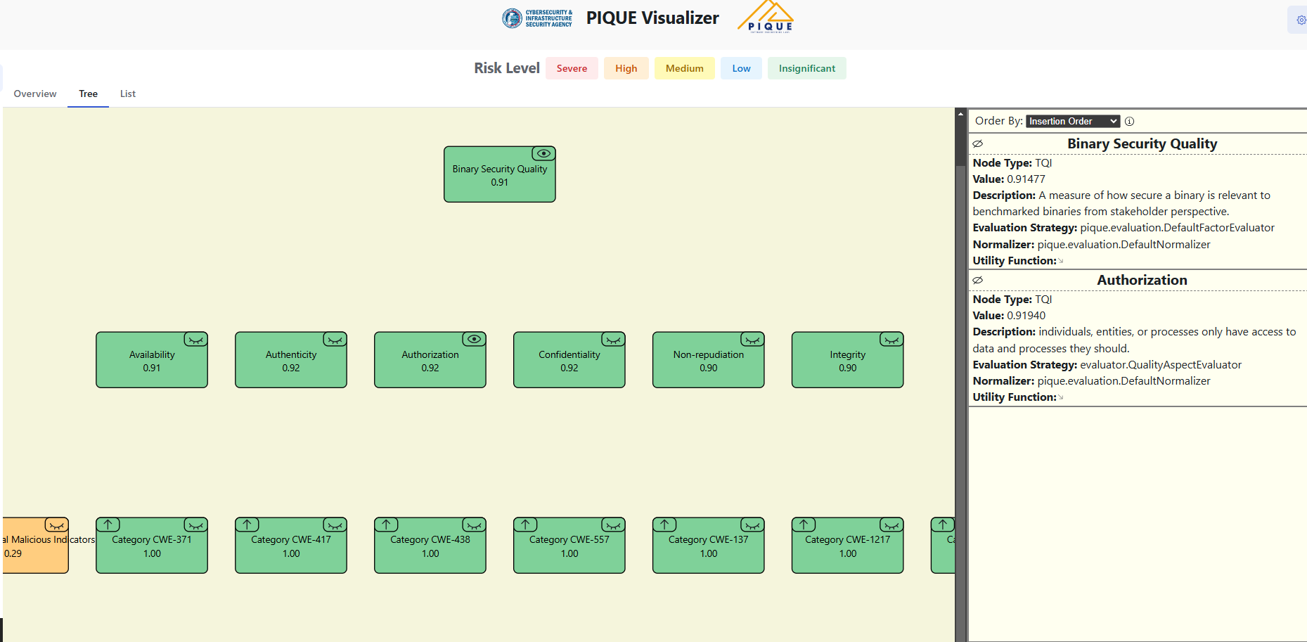
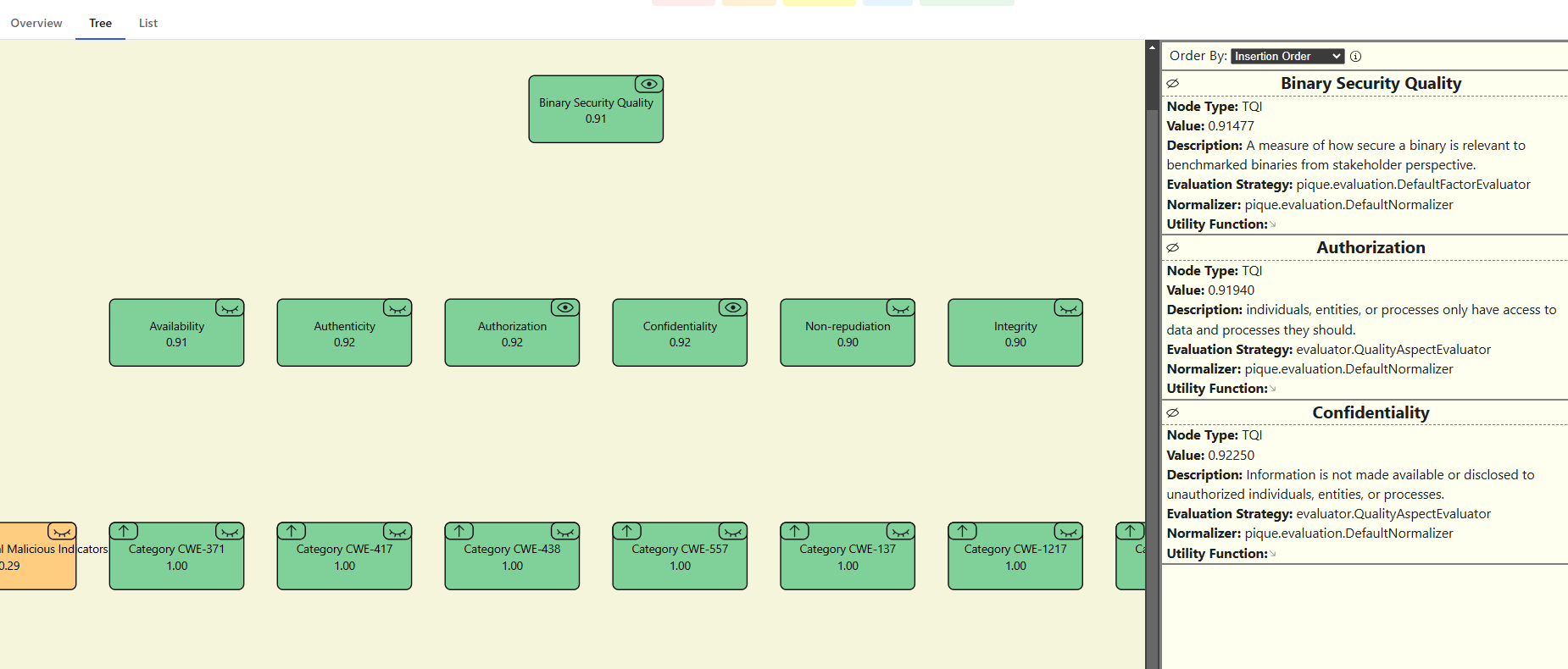
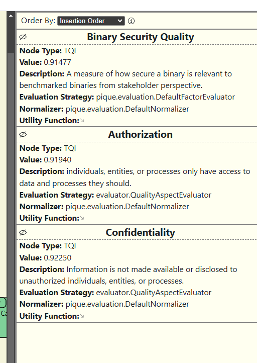
- Press the eye button in the sidebar to see detailed info, including the node’s score
Visual Elements
- Nodes connect with lines to show relationships
- Each node has a score and subnodes display percentage values to show their contribution
- Clicking a node expands its structure for better visibility
Example Views
Single-Level
Press a node to see its percentage distribution from its children.
Multi-Level
Node Details Sidebar
Press the eye button in the sidebar to see more details about a node, including its score.
Nested List Display
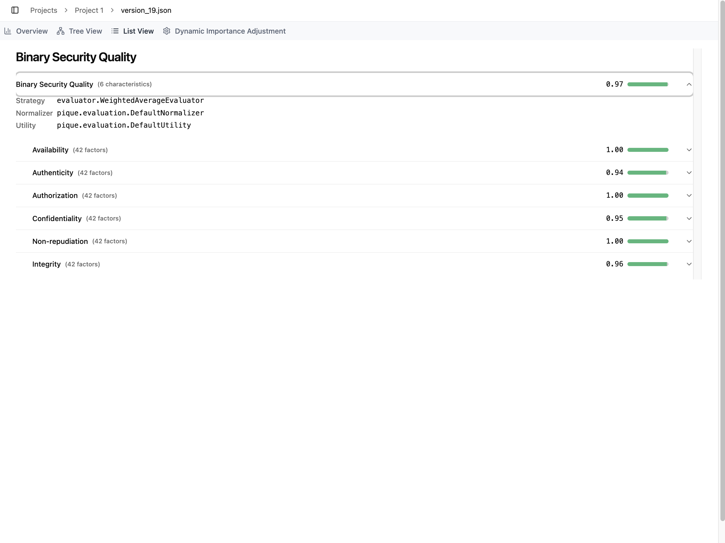
The List View presents the selected version in a structured, nested list format. This view allows users to explore the PIQUE quality model from the top level down to individual factors, measures, and diagnostics.
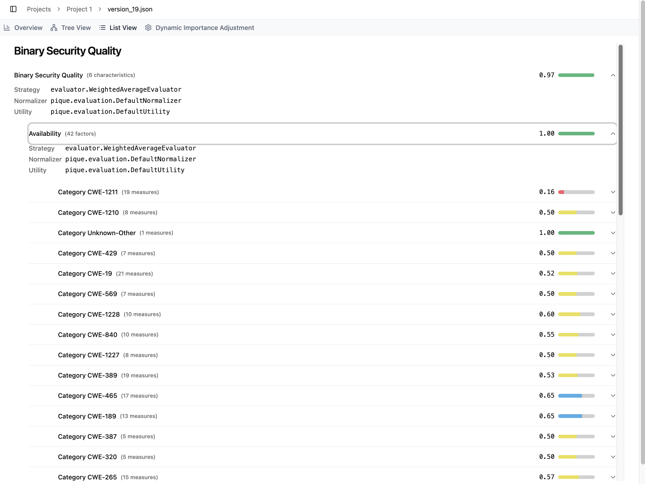
When the user first opens the List View, all sections are collapsed by default. Only the root node (e.g., Binary Security Quality) is visible. Expanding the root reveals all Quality Aspects, while deeper levels remain hidden. Each level is visually indented beneath its parent node, helping users understand the hierarchical structure of the model. For example, all Quality Aspects (such as Availability, Authenticity, etc.) appear slightly indented beneath “Binary Security Quality,” indicating that they are its direct children.
Users can continue expanding items to reveal further levels of detail. Expanding an Aspect displays all associated Product Factors; expanding a Factor displays its Measures; and expanding a Measure shows its Diagnostics. The screenshot above demonstrates the fully expanded view under the Availability aspect, where all related factors are listed.
Each item in the list includes both textual information and visual indicators:
-
The left side displays the item’s name, and when expanded, additional metadata such as its Strategy, Normalizer, and Utility.
-
The right side displays the item’s computed score, accompanied by a colored bar whose color reflects the item’s risk level.
- For high-scoring items (e.g., the TQI with a score of 0.97), the bar appears green and nearly full, indicating low risk.
- For low-scoring items (e.g., Category CWE-1211 with a score of 0.16), the bar appears red and much shorter, clearly signaling a severe risk level.
This nested layout and its visual cues allow users to quickly identify areas of concern while maintaining a clear understanding of how each item fits into the overall quality model.